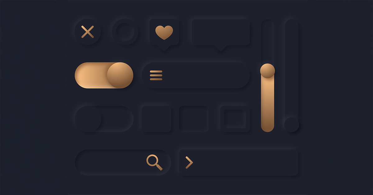
Dark Mode has taken the digital world by storm—from smartphones and desktop apps to websites and operating systems. More than just a trend, it’s rapidly becoming a user preference for both aesthetic and functional reasons. Let’s explore why users love Dark Mode and offer practical tips on how you can implement it in your designs.
What Is Dark Mode Design?
Dark Mode (sometimes called Night Mode) is a color scheme that primarily uses dark backgrounds with light text and elements. Instead of the conventional black-text-on-white-background, it inverts (or nearly inverts) that palette. While it’s not entirely new—developers, designers, and gamers have used dark-themed environments for years—Dark Mode’s popularity has surged in mainstream apps and operating systems, largely thanks to mobile OS updates and user demand.
Why Users Love It
Reduced Eye Strain
One of the biggest selling points of Dark Mode is its potential to reduce eye strain, especially in low-light environments. When you’re scrolling through your phone or reading on a screen at night, a darker interface emits less light and can feel gentler on the eyes.
Prolonged Battery Life
On OLED and AMOLED screens, black pixels are effectively “off,” which can lead to lower energy consumption. Users often switch to Dark Mode on their smartphones or tablets to extend battery life—an important benefit when you’re on the go and can’t always find a charger.
Sleek, Modern Aesthetics
Many people simply find Dark Mode more visually appealing. A dark UI can look elegant, modern, and even futuristic, aligning well with certain brand styles and product personalities.
Enhanced Focus
When the background is dark, the content or focal elements (like text, images, and interactive components) pop out more prominently. This can help users focus on the core functionality or information on the screen.
Customization and Personal Preference
Users love having the option to customize their experiences. Providing a dark theme alongside a standard light theme caters to a broader range of tastes and needs, improving overall satisfaction.
How to Implement Dark Mode
While Dark Mode can be a big hit with users, simply inverting colors isn’t enough. You’ll need to consider contrast, legibility, and brand identity to deliver a great user experience.
Choose an Appropriate Color Palette
Opt for shades of dark gray rather than pure black to maintain a comfortable contrast without harsh transitions. Pick complementary highlights that align with your brand. Neon colors may look striking, but they can also be jarring on dark backgrounds. Also, use off-whites or light grays instead of stark white. High contrast is essential, but pure white on black can cause eye fatigue over time.
Prioritize Legibility and Contrast
Follow WCAG Guidelines. Aim for minimum contrast ratios of 4.5:1 for body text and 3:1 for large text, icons, or UI components. Subtle shadows can define elements like cards or modal windows, providing depth without overloading the interface.
Maintain Brand Consistency
If your brand identity heavily relies on certain hues, adjust those colors for Dark Mode so they remain recognizable and maintain their emotional tone. Keep fonts, icon styles, and other branding elements consistent between dark and light modes to preserve a unified brand experience.
Provide a Seamless Toggle Experience
Make sure users can switch between light and dark themes easily—often via a toggle in the settings menu or a visible icon in the header. Some users prefer an auto-switch based on their device’s system settings or time of day (light theme during daylight, dark theme at night).
Test in Multiple Environments
Check your Dark Mode design on different devices, screen resolutions, and operating systems. Test it in both bright and low-light settings to ensure text remains readable and visuals maintain clarity. Use screen readers and color-blindness simulators to confirm your design works for all users.
Accessibility Considerations
Dark Mode can be beneficial for many users, but it’s not universally better for all. Some individuals, particularly those with certain visual impairments, might find high-contrast dark interfaces more difficult to read. Keep these points in mind:
- Offer a Light Theme: Always provide a default light-mode alternative for those who find it easier to read.
- High-Contrast Toggle: Consider including a high-contrast option within your Dark Mode for users who need added clarity.
- User Preferences: Respect system-level preferences (like macOS or Windows’ Dark Mode setting) to automatically adapt to the user’s choice.
Final Thoughts
Dark Mode is here to stay—its fusion of style, usability, and energy efficiency resonates with a wide swath of users. By offering a well-executed dark-themed UI, you cater to user preferences, differentiate your brand, and show that you value user comfort and choice. However, implementing Dark Mode involves more than just flipping a color scheme. Carefully plan for contrast, test in various conditions, and prioritize accessibility to ensure a truly delightful experience.
Ready to explore Dark Mode for your app or website? Schedule a consultation with Magna Technology at 617-249-0539 to learn more!


